A good example of how misleading information can be spread
We've all seen these posts or gotten those email forwards: in a nice little picture or a few sentences a very convincing argument is made about why someone should believe in something. The reader is then challenged to pass it along. No references or greater context are given, just a compelling message. Unfortunately, a good number of times these are very misleading but unfortunately they spread virally with little to no fact checking. A soccer buddy, we'll call him "Idiot Savant" (at their request), took one of these graphics recently and did a little research to break down the true facts. They spent a LOT of time researching this and found some really interesting stuff, hopefully you'll find the time to read it. My conclusion on all of this? I have some really smart friends with a lot of patience to write a 15 page blog post. Below is their report:
Recently this chart on the Republican Policy Committee website was the latest "anti-Obama" fodder to hit the Facebook-verse.
I grew up distrusting monetarily biased information disseminated for easy consumption, amongst other distrusts. This leads me to ask a lot of questions, much to the dismay of my high school English teachers (though my math, science and history teachers seemed to be much more accepting).
As I've done in the past with such things I quickly put together a "information behind the information" list based on the chart and its sources. The sources are mainly from Government offices, the best source for this raw data.
Notyourtypicaltechguy asked me to write up a more Blog friendly version of what I wrote.
On the original link, if you click on each statistic you get sent to the source of their raw data. Most of these links were pretty direct, some require some further research to get to the numbers they used.
My big issue with this chart, and what prompted me to put this together, was the chosen start date. We all know what happened in the economy at the end of the G.W. Bush presidency, and to assume that a single Presidential change could fix all that in 2-3 years is a logical fail in of itself. I don't believe McCain's plan would have gotten us by any better, but I also don't think we would have been that worse off than we are now under him, at least economically.
The Chart
What this chart does is it takes advantage of the lack of common education that most Americans apparently have, as to how our government actually operates.
First, what appears to be a common misconception as to how the federal budget is put in place. While the media (mostly), and political parties (when it favors them), like to think of budgets as belonging to a certain president, this is in fact, not exactly how the federal budget works, Wikipedia has a good entry on this process,
The Budget of the United States Government is the President's proposal to the U.S. Congress which recommends funding levels for the next fiscal year, beginning October 1. Congressional decisions are governed by rules and legislation regarding the federal budget process. Budget committees set spending limits for the House and Senate committees and for Appropriations subcommittees, which then approve individual appropriations bills to allocate funding to various federal programs.
After Congress approves an appropriations bill, it is sent to the President, who may sign it into law, or may veto it. A vetoed bill is sent back to Congress, which can pass it into law with a two-thirds majority in each chamber. Congress may also combine all or some appropriations bills into an omnibus reconciliation bill. In addition, the president may request and the Congress may pass supplemental appropriations bills or emergency supplemental appropriations bills.
http://en.wikipedia.org/wiki/United_States_federal_budget
So, as we can see, depending on the makeup of congress, the budget can take on a much different form than what the president would actually want. The president can influence the budget, but ultimately it is our regionally elected officials that write and approve it. I’m not going to discuss what was and was not part of the Obama budget, and how it all changed, just remember that both sides share in some responsibility as to the “good” and “bad” of the budget, but that ultimately a president’s influence on the budget does not begin until the October following his inauguration.
As for policy decisions, this too has a delayed initiation time. The president does not actually implement policy on his inauguration day, and any non-budget related policy, especially in these intervening months, has little budgetary effect, though it can influence corporate leaders as to how they budget their business. This can obviously affect how some of this data works out based on current and expected taxation. Business operate their yearly budget based on how it affects their current tax year; if the following tax year is slated to have a negative effect on business they will generally try and move some of their business to the current year where it could be more tax favorable, and if the next year is better they can delay business until it is more tax friendly for them. Since the understanding of the following years tax code is not fully known until later in the year this generally has more of a November/December effect or January/February effect, both of which mean the changes between a president’s inauguration and his first budget day are still mostly affected by the actions of the previous president and congress.
For simplicity, I will refer to the Obama Budget and the Bush Budget as such, allowing the reader to keep in mind what these dates actually mean.
Bias: Yours, Mine and Theirs
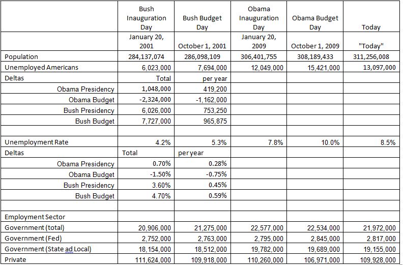
So why would the RPC choose to use his inauguration date? One can only assume because it makes his presidency seem all that much worse. Looking at the data and inserting an "Obama Budget" column seems to bear this out. I also took some time to comb the data and add a "Bush Budget" and a "Bush Inauguration" column, to point out other telling peaks, and to do some math on the changes over the course of both presidencies, the Deltas. The point of all this was not to somehow prove Obama is the greatest president, or that he can do no wrong, only to point out one of the biases of my personal take on government, that economically it doesn't much matter who you elect in the end.
Now, some notes on the math and data. I've got an excel spreadsheet with all the math, etc. If I made a mistake please let me know and I'll fix it. Second, exact numbers for exact dates is not necessarily possible. As such, I will use the closest approximation I can, which generally means "January" numbers for January 20th, and "October" numbers for October 1st. As well, for "Today", I use the latest available information from the exact same sources as the RPC uses. As for per year numbers, Obama has been in office for 3 years now, but his budget is only 2.5 years old, for G.W. Bush both are based on his 8 years. I’m hesitant to break this down this way though, since what we’re really concerned with is the fiscal crisis that plagued the end of the G.W. Bush presidency and has plagued all of the Obama presidency, for the sake of my sanity, and the brevity of this document though, I will lump all of G.W. Bush together, keep this in mind, it’s both good and bad for him…
Unemployment
(Seasonally Adjusted, in millions unless otherwise noted)
For reference I placed the total US citizen population for each time period. In theory these numbers don’t include illegal immigrant labor, but they also don’t include “under”-employment, or the non-reporting unemployed, so as with all statistics, a salt container is required, but since in theory, the numbers are based on the same for all time periods, they’re a somewhat fair indicator.
As we can see, these numbers tell a different story. Unemployment since the Obama Budget has actually fallen by 2.3. But it did go up 3.3 since his time in office, a net change of 1.05 in 3 years. Under Bush we get to see some even more telling, and damning numbers though, his per year numbers are more than twice Obama’s, this is averaged over his 8 years keep in mind. So the final days of his presidency, in both methods, have to either be much worse, or slightly worse and the previous years of his presidency very, very bad. I implore you to look at the raw numbers.
To give some different context, one can look at the percentage rates. They basically tell the same story, but some people prefer to grasp large numbers as percentages.
Employment, By Sector
One area that Republicans love to remind us about is the size of government, so let’s look at what the Bureau of Labor Statistics has to say about those employed in government and non-government positions. This data can all be mined from the links on this page, searchable raw data can be found here. Let me just say, the time I spent mining through all this data is some of the most enjoyable time I’ve spent online. The fact that his data is available with such minute details accounted for is truly amazing.
Some interesting facts I discovered, local government employs the most, by far, due to all the teachers, police, fire, garbage, etc workers, followed by the State level, and then the Federal, which is about half of the State level by total. I do not know where military falls into all this, as there is no military supersector to choose from.
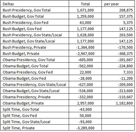
These numbers are pretty telling as well. I’d like to point out two things. First, during Bush’s terms the total private sector lost just under 3 million jobs while the total government job change was an increase in 1.3 million, 147,000 of which were federal jobs! So far, under Obama, the Private sector has gained back all of those 3 million lost during Bush with a loss of 562,000 government jobs at all levels, of which 11,200 are at the federal level.
Let’s be fair to both though, there are 9 months between the presidency and budget dates, a period where the economy was still reeling from the crisis, let’s see what happened during this time. From these numbers what we see is that “all” of the Bush budget jobs were lost during this time, but also, that all the Obama presidency jobs were lost during this time as well, so in the end, it’s tough to say who exactly is to blame for those 3 million lost jobs. Well, I know who, but it wasn’t really either of these two men… The government jobs though are a little different, most of those lost were done so during Obama’s budget. It would be interested to see which states and localities lost the most, what the political leanings of their elected officials are, and which states are doing fiscally better now.
That’s all I really have to say about the employment numbers at this point. I could mine data on this for days and find interesting statistics, but that will be left for another time.
Gas
This is the first of several categories on this chart that people love to associate price with presidential/governmental actions. Rarely do federal policies actually have any effect on prices, but this association still stands. I guess some people want every little last bit of their lives to be dictated by the workings of the president and Congress, even if their political color is red.
Man, more great data, this time courtesy of the US Energy Information Administration! They have a great data mechanism that can be found here, lots of nice detailed data down to the week, these numbers will be almost exactly to the dates on the chart! Actually, I chose the week including the date, since gas prices generally stay for about a week at a time. This is also the average price for regular gas of both conventional and reformulated variety across the country. The EIA has data on all fuel types though, and even breaks it down by area. Gasbuddy.com also has data going back 6 years, I assume this is when they started, and so the data is from their user collected pool. Since the EIA is what the RPC used it is what I’m using, it also goes back further in time, and has a more complete set of info on their survey, including the actual form!
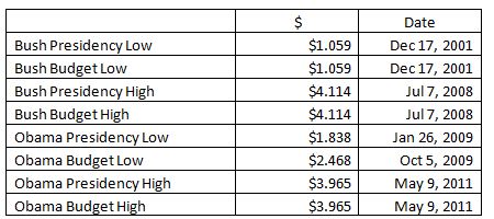
The basic numbers tell a pretty obvious tale, gas prices, over time, tend to go up. What’s interesting is how much and when, as we know how much they can fluctuate. So let’s instead look at some low’s and highs. Right now, Bush still can claim the highest gas prices of both the presidency and budget periods, at $4.114/gal, with Obama only 20c behind at $3.965/gal. Bush of course, had a much lower low of $1.059/gal to Obama’s $2.468/gal, with a point during the budget/presidency interim of $1.838/gal.
Gas though has a lot of different influences on it’s price, consumption, reserves, etc. All of which is too much for here and now, but I did find fascinating the graphs showing the trend since 1990, as gas prices remained consistently below $2/gal, roughly $0.80/gal to $1.50/gal, until the end of 2003, when they began their slow rise above the $2.00 mark, never to return again.
Budget
The annual budget deficit is the difference between actual cash collections and budgeted spending (a partial measure of total spending) during a given fiscal year, which runs from October 1 to September 30.
http://en.wikipedia.org/wiki/United_States_federal_budget#Understanding_deficits_and_debt
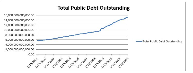
No matter how you chop this one, it just looks bad. Over the last two presidencies our national debt has ballooned, there’s no way around that. Name your cause, no matter what side of the political divide you’re on, and well, you’d be correct! That’s cause everything you’ve all listed is the cause, it all helped get us to where we are today.
What I find fascinating though about the raw numbers is that they apply just as much to Bush as they do to Obama, his affect on the debt was just as bad, so to try and point out “how bad it has been” under Obama and to say the Republicans are the answer is shooting yourself in the foot. Sure you could talk about Democrat controlled congresses, etc. to justify yourself, but for this chart you can’t change your metrics in the middle.
There’s one big item of note to take into consideration when looking at the national debt, and that is that over the years the population of the country grows, this is where the debt burden per person comes in, it’s sort of a way of normalizing the debt total. It’s not the only method of course, one could normalize vs GDP, gross domestic product, which is generally accepted as the total aggregate worth of the nation in both its goods and its services, ie work-done capital.
The fact is, taken on an average yearly basis in dollars per person, both presidents are pretty much equally as bad no matter how you cut it. Since the economic collapse the percent of increase went up quite a bit, but, as of last year, the increase has dropped down to mid-Bush levels. It’s hard to say what this year will hold, but that also argues that unless we let the Obama policies ride out we will never know if they are working/worked overall. What we do know is that a >5% per year increase is common, and we can all agree that this is not good.
Of course we all want to see the debt go down and GDP go up, and really what we all want is the GDP to go way up so as to hopefully increase tax revenue greatly. How to do this I’ll leave up to the reader and their political opponents to argue over.
Misery
Oh the misery!
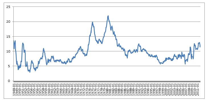
The misery index was initiated by economist Arthur Okun, an adviser to President Lyndon Johnson in the 1960's. It is simply the unemployment rate added to the inflation rate. It is assumed that both a higher rate of unemployment and a worsening of inflation both create economic and social costs for a country. A combination of rising inflation and more people out of work implies a deterioration in economic performance and a rise in the misery index.
The Misery Index is calculated as the unemployment rate summed with the inflation rate. There’s not much to say here other than one man’s misery is another man’s “who gives a fuck?”.
So let’s look at this misery index over time and see where we lay…
It looks like we’ve been pretty miserable for the last 60 years, with some spikes and not many troughs. Reagan brought us down from a Carter misery high, and with the help of Bush and Clinton brought us down the lowest we’d been since Lyndon B Johnson. That said, since 2007 the index has jumped up and down all over the place. Are we, comparatively, that bad off? Not compared to Reagan, but we’re no Clinton era either.
College Tuition
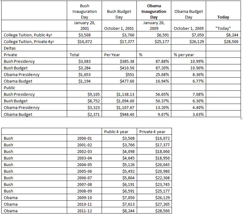
The numbers shown on the RPC are for a 4 year public college tuition for in-state students. I threw in Private college to give some comparative data.
This is another one of those categories inexplicably tied to the president and Congress. This one is a little more true in that our tax dollars go to pay for public colleges, and when less tax dollars are taken in less can go to these services.
As we can see though, the increase in college tuition during the Obama years has gone up slower than it has during the Bush years. Sure, it’s going up, but as we can see, and as to be expected, the cost has always gone up, and if anything, has been pretty stable in its increase, except for a small blip between 2003 and 2004 one of those events where it is making up for a previous 10 years of not going up, and this blip hurts Bush’s numbers. If we look at the raw numbers, we see this blip occurs about every 10 years, so I would say we should expect a similar 2 year blip within the next few years.
All in all, I have to say the cost of a college education is and always will go up, partly due to inflation of course, but also due to an increasing number of children going to college per capita. This is the big thing that people forget about this. The National Center for Education Statistics has some good info on this. As we can see, the percent population increase in the country (non-institutionalized) is on average about 1%, while the percent increase in the student population generally well above that, with just some years of matching and even negative increases. As well, the percent of students per total population increases over time, by about 0.1% to 0.2% on average, so we have more people going to college, at all levels each year, while we have less people paying taxes to support them, and in tough economic times like now, even less tax income. Interestingly, the periods of large increase in cost of public education correlate almost directly with the periods when the number of students going does not grow as a percentage.
Anyway, the point is, college, over time, gets more expensive for society as more people as a percent of total population attends, so this RPC chart is only throwing this in as a scare tactic, nothing more, it shows no historical significance as it is as damning a progression towards Republicans as it is towards Democrats.
Worker Health Insurance Costs
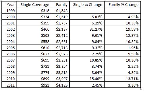
This one was a pain, the link they provide does not, in fact provide any of the numbers they list. The website, The Henry J. Kaiser Family Foundation, does provide this information though. From this we see that the percent increase by year fluctuates fairly randomly regardless of who is in office. The number does keep going up, yes, but it did so under Bush as well, in fact the largest increase in the last 12 years was under Bush, almost 20% his first year in office, compared to Obama’s largest increase, of 14% his second year. The people though, that should worry the most are non-family, single payers, for whom the increase since 1999 has been 22% greater than for families! With more and more people foregoing the family life for the single life, this is affecting more and more people. Perhaps THIS is why our national insurance costs are going up!
Food Stamp Recipients
Government handouts to poor people, they are a horrible bane on our society. This money would be better handed out to corporations, so they can create jobs! But these people are just too lazy to get jobs, and why are they lazy and jobless? Because they know the government will give them free money for food of course!
Logical conclusions at its finest.
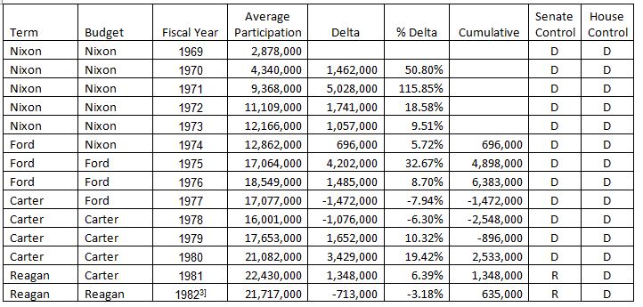
Anyway, This category has been an odd one to research as the availability of raw data is limited, and because of how it is represented, the hard values obtainable are ill suited to direct comparison. The RPC chart uses this source, which is monthly numbers since the last year of G.W. Bush, but similar data is not easily available for years prior. I’ve chosen to use this source, which has yearly statistics dating back to 1969.
So what do we find? Well, Obama’s presidency has been marred by a large percentage of the population un- and under-employed, and in the need of government assistance for food. But this is to expected in an economic crisis. This is not really telling of much beyond that. What is more fascinating is that under Clinton the total dropped so drastically, 8 million less people, all of which it only took G.W. Bush 5 years to undo! That is, by 2005, the 8 million drop by Clinton was completely undone by G.W. Bush., before the economic crisis even hit! In fact, both Bush presidencies were really bad in this regard, Reagan ended with 2.5 million less, H.W. Bush killed that in between his 2nd and 3rd year.
What does this tell us? It doesn’t matter which party your president is from in correlation with Food Stamp numbers. Perhaps this is more under the control of Congress? So I decided to look to see if there was a correlation between the House and Senate makeup and the changes in SNAP numbers. The best correlation I could find comes from here. It looks like if the Senate is controlled by Republicans the numbers go down, at least until G.W. Bush, were this trend goes away. There is also a ~2yr offset in this correlation, all in all I would not say this is a strong correlation, as it obviously also does not take into consideration the plethora of other factors, but it’s the best I could come up with for those that feel these types of things correlate.
Americans in Poverty
The Census.gov website produces a yearly report on Income, Poverty, and Health Insurance Coverage in the United States. This report is released in September for the previous year, so there is still no data for 2011. That said, the current people in poverty has increased during Obama being in office.
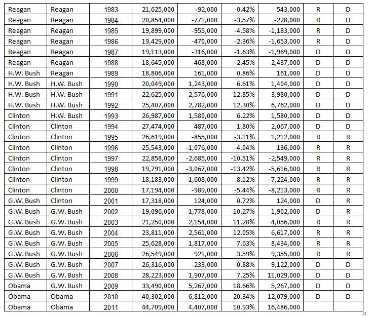
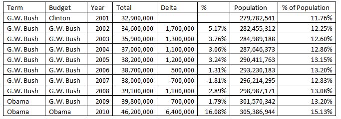
Taken out of context, this is a pretty damning statistic. Even if you take the number as a percentage of total population, the numbers still don’t look great for Obama, but the total increase doesn’t look quite as bad, an increase from ~13% to ~15% during an economic crisis isn’t so bad, right? I mean, that doesn’t include unemployed not in poverty I think?
I think this statistic is more damning towards society as a whole than towards any president. We live in the greatest country in the world and yet somehow the business world accepts that more than 10% of the population lives below the poverty line.
Home Values
This one gave me a good laugh. Let’s compare a values based on a G.W. Bush era bubble to what happened AFTER that bubble collapsed, because this is a reasonable comparison!
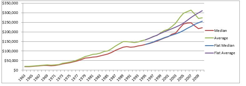
So the PRC uses a site called Zillow. I don’t know much about this site, though they do seem to track home prices. There are many sites like this. Census.gov also has this PDF which tracks median and average sale prices back to 1963.
Zillow does provide an excel file with their raw Data though, going back to 1996 by month, which is fantastic data. I used the Zillow Index, as it is what the RPC used and because they use some fun math to average all sorts of data together.
What we can see from this graph is that there are two localized bubbles where the prices begin to increase at a rate much faster than previously. Both are followed by the “burst” when housing prices normalized out again, dropping down to a point that is more in line with where the housing curve was headed previous to the bubble. I added a “Normalized” curve to the graph to show what would have happened during both of these events if the curve had played a little more flat, based on the average% increase starting 13 years earlier until that year. What we see here then is a concept of what could have potentially happened had the increase in home values had more of a flat curve during this period, ie, no bubble. This isn’t perfect, but it matches the slow overall progression of the increase in housing prices over the years. This doesn’t really tell us much other than a potential occurrence had the housing market not bubbled, so, this is just a “fun number”. What would be interesting to see is at what point in the future does the sale price again follow this previous curve, if ever? Very many variables involved and I can’t help but think that all those homes sitting unused are going to sit there for a long time if not forever. I can’t see how anyone would ever speculate on where people will want to live and be able to find jobs.
US Global Competitiveness
From Wikipedia,
The Global Competitiveness Report (GCR) is a yearly report published by the World Economic Forum. The first report was released in 1979. The 2011–2012 report covers 142 major and emerging economies.[1]
Since 2004, the Global Competitiveness Report ranks countries based on the 'Global Competitiveness Index', developed by Xavier Sala-i-Martin and Elsa V. Artadi.[2] Before that, the macroeconomic ranks were based on Jeffrey Sachs's Growth Development Index and the microeconomic ranks were based on Michael Porter's Business Competitiveness Index. The Global Competitiveness Index integrates the macroeconomic and the micro/business aspects of competitiveness into a single index.
http://en.wikipedia.org/wiki/Global_Competitiveness_Report
I was unable to find the rankings for anything past what is shown on the Wikipedia page, so there’s not much historical data here. This one I’m afraid we’ll have to leave as it is, and we let the reader take from it what they will.
Conclusion
Anyone can skew facts in their favor, it is of course, all in the presentation. Staunch Republicans will look at this chart and go "aha! See! Obama is a bad president!", but they will be much harder to convince that Bush was equally as bad using the same metrics, or more so that in many areas they purportedly claim to care about, Obama has been much better than their beloved candidates.
What amazes me most is that just in the time since Reagan, so much about both parties, but especially the Republicans, has changed. The unemployment statistics really bear this out. They just don't make 'em like they used to...
